
The Matching Task
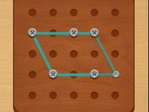
Each puzzle in Visual Pair Quest presents a single image at the top of the screen. Below it sits a set of candidates, and your job is to pick the one that matches exactly. The difficulty comes from spotting subtle differences in shape, color, and arrangement rather than from complex controls. A correct choice moves you to the next set and gives a small sense of progress.
Visual Style and Mood
Bright, friendly graphics keep the screen welcoming. Images are clear and distinct, with little clutter, so your eye can focus on the matching task. The soft color palette supports a stress-free pace, which makes the game approachable for younger children and older adults alike. Nothing on screen feels busy or dark.
How Difficulty Grows
Early puzzles use obvious matches, letting new players settle into the rhythm. As you continue, images become more detailed and demand closer inspection. This gradual increase keeps your mind engaged without creating frustration. Because there are no timers or penalties for wrong picks, you can study each set for as long as you like, whether you have a short break or a longer session.
Controls and Accessibility
On a touchscreen, a tap selects your answer; on a computer, a mouse click does the same. The interface stays minimal, showing only what you need. No tutorials or manuals are required, and there are no complex menus or settings to navigate. That simplicity lowers the barrier for casual players and puzzle fans who want to start immediately.






Comments
0 comments